
Tabby.ai
Internationalisation, design systems and right-to-left styling. How we built Tabby.ai's website component library.
Introduction
Meeting growth demands
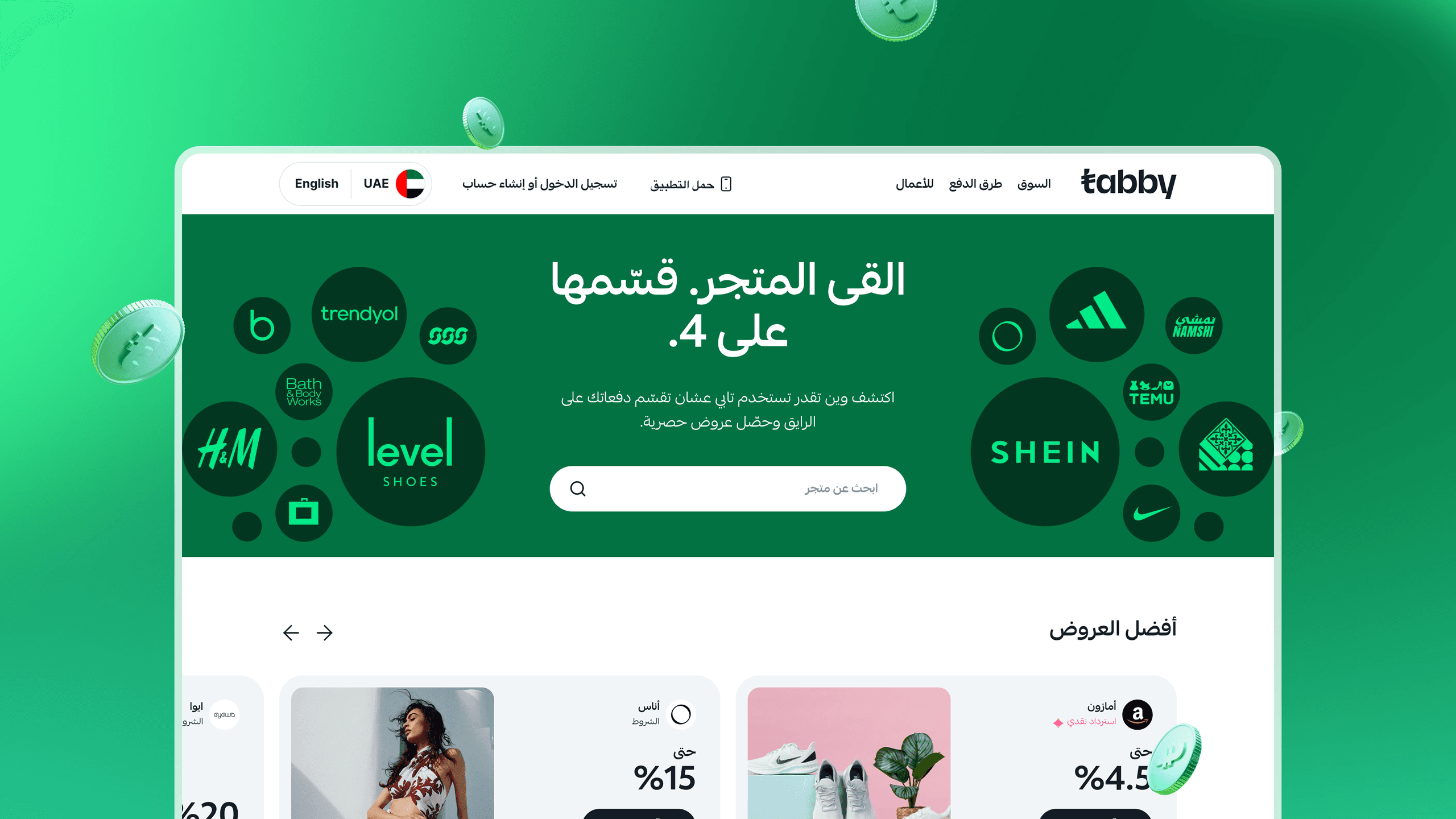
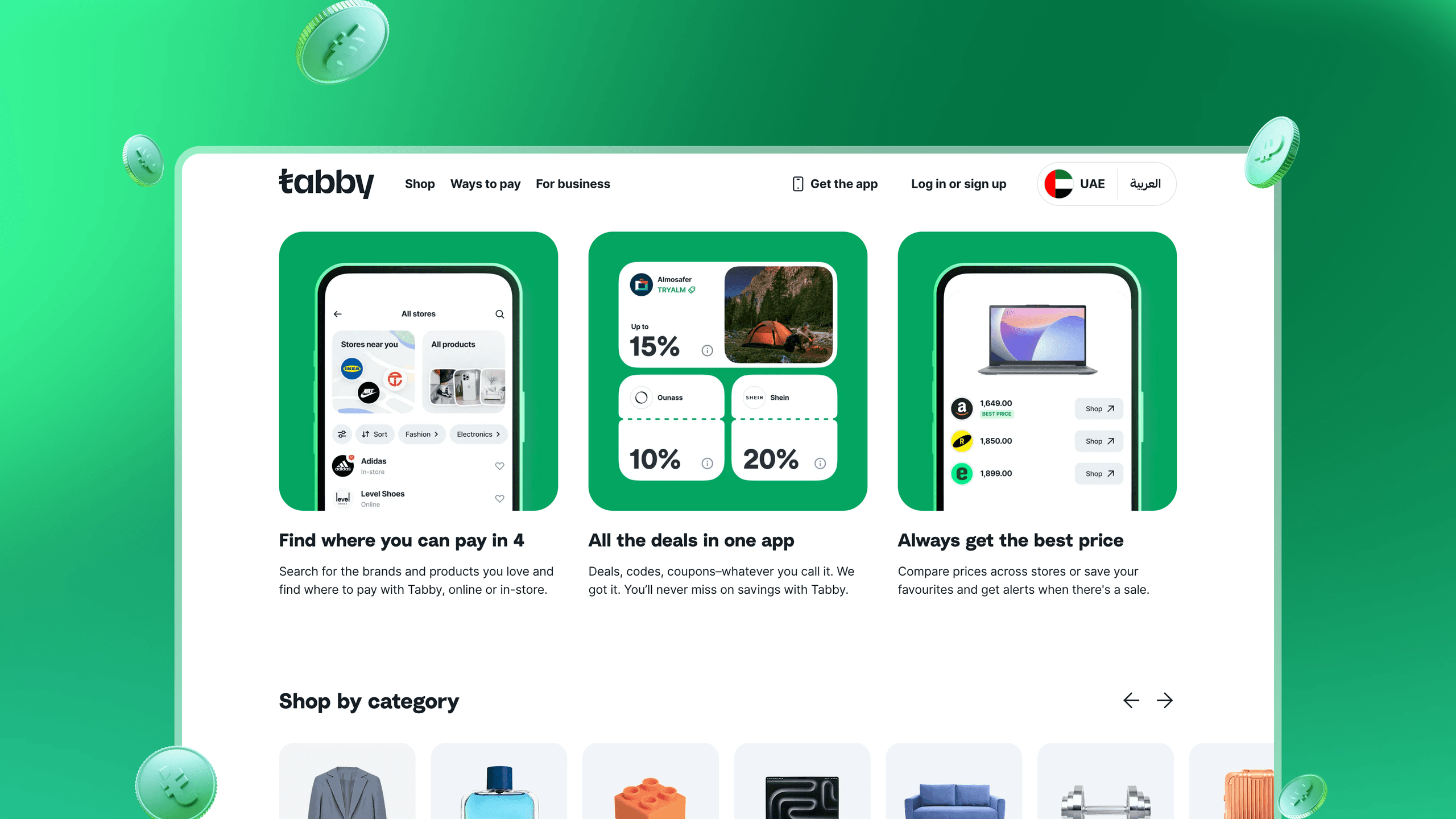
Tabby AI is a leader in the UAE's "Pay in 4" space, and their rapid expansion had outgrown their setup. They needed to scale up their design system and composable infrastructure to work hand-in-hand with their website.
Our job was to build the component library that sits under Tabby AI's whole digital experience. That meant more than code: an accessible interface that worked across their markets, with internationalisation (i18n) and accessibility built in from day one.
Infrastructure
Collaborative build & integration
The whole process felt like a true partnership between our crew and the brilliant developers at Tabby AI.
We rolled up our sleeves together, focusing on creating a component library that wasn't just visually slick but also incredibly functional and easy for their team to use and extend.
The latest Storybook component browser let us document and test each component in isolation, which made the whole build faster. Both teams could see progress clearly and iterate quickly. A special shout-out to their designer, Sergii, who documented and scoped components in a Figma environment like I've never seen before.
We weren't just delivering code, we were building a shared understanding and a toolset their internal teams could keep extending long after our involvement wrapped up.

Publishing content
Cutting Sanity debt
Alongside scaling the frontend infrastructure, we tackled the backend migration: upgrading Tabby AI's content platform from Sanity v2 to v3.
This wasn't just a version bump but a golden opportunity to slash accumulated development debt and completely rethink their content structures. We checked their existing schemas, identifying pain points and areas for simplification.
The move to Sanity v3 allowed us to implement much more reusable data structures, meaning content could be created once and surfaced dynamically across different parts of their site and apps. This made the editors' lives easier and drastically reduced redundancy and potential inconsistencies. The result was a faster, cleaner, and far more maintainable Sanity Studio that gave them a gold standard in editorial experiences.
Services


Get in touch
Tell us what you're building. We reply within one working day. Jono or someone on the team picks up every message personally.